
Today I am going to provide an overview of the Summary Report dashboards in Sitecore CDP.
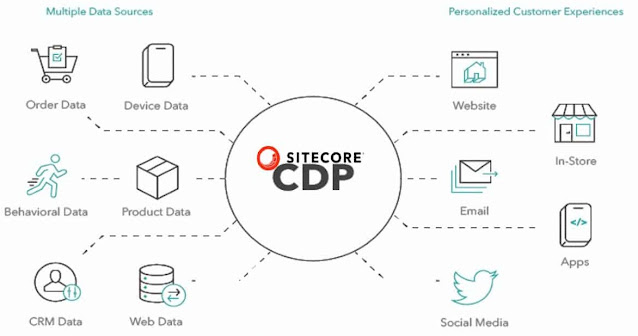
Sitecore CDP is an enterprise-level customer data platform that helps various businesses manage and lift their customer data to drive better customer personalization and experiences. The Sitecore CDP is designed to provide an exceptional experience to every individual on all digital channels. The functionality of CDP's data management is augmented with decisions, predictive analytics, experimentation, and orchestration.
Organizations are constantly searching for new and different ways to leverage the potential value of their customer data in today's data-driven environment with the goal of obtaining valuable information and making educated choices. Sitecore CDP provides you with a centralized location for storing all of your customer data, allowing you to unify, clean, and enhance it for effective analysis. The dashboard feature of Sitecore CDP enables you to concisely observe and analyze your customer data within Sitecore CDP.
The Summary Report dashboard visualizes the trends from the data that is ingested by Sitecore CDP. Marketers or Business Users can use these reports to gain insights about the seasonal data, and performance of promotional campaigns, and to get ideas about experiences and experiments.
The data of the Summary Report is refreshed after every 24 hours. Organizations can use the filters available in the Summary Report to select the time frame and the channels to display the data. The default view shows the data for the past six full months, with no specific channel.
Guest Reports
Guest Reports section in the Summary Report displays the data related to guests who visited the website over a selected time period.
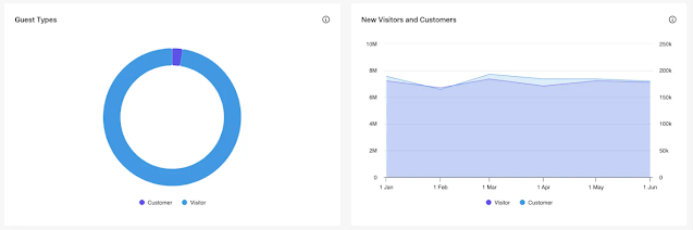
Guest Types - This graph represents the proportion of each guest type of all the guests that visited the website over the selected time period, i.e., customers or visitors. Some customers might also be observed as the traveller guest type.
1. The proportion of each guest type is calculated by dividing the number of guests of a given type by the total number of guests.
2. To observe the number of each guest type, hover the mouse over the guest type graph slice. An information callout displays which represents the number of each guest type.
New Visitors and Customers - This report represents the users of the website who are categorized as either new visitors or customers (whether they are fresh profiles that have been identified as customers or users who have converted from visitor type) within the selected time period.
1. New visitors are counted as visitors who were first seen during the selected time period, i.e. the value of first_seen falls within that period.
2. New customers are counted as customers who were first seen during the selected time period i.e. the value of first_seen falls within that period.
3. To observe the total number of new visitors or customers, hover the mouse over the new visitors or customers graph slice. An information callout displays which represents the total number of each guest type.
Order Reports
Order Reports section in the Summary Report displays the data related to transactions and their details over a selected time period.
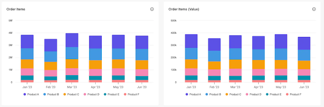
Order Items - This graph represents the breakdown of order items by item type over the selected time period. This graph does not include the items that are classified as other items and are handled in a separate report. The data is calculated by counting order item types for the selected time period.
1. To observe the total number of each order item, hover the mouse over its segment in the bar chart. An information callout displays which represents the total number of each order item.
2. Click on the name of an item type in the legend to remove it from the graph.
Order Items (Value) - This graph represents the proportionate value of order items over the selected time period. The data is calculated by summarizing the values of each item type for the selected time period.
1. To observe the total value of each order item, hover the mouse over its segment in the bar chart. An information callout displays which represents the total value of each order item.
2. Click on the name of an item type in the legend to remove it from the graph.
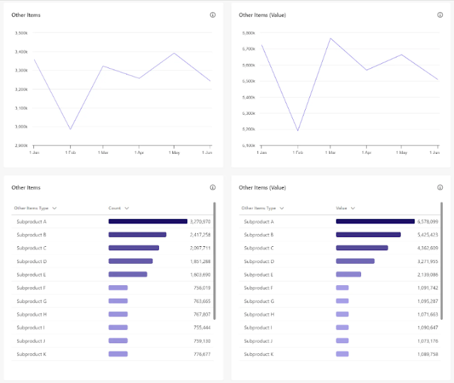
Other Items - This graph represents the breakdown of other order items over the selected time period only if you use the other items classification. The data is calculated by counting other order items for the selected time period.
1. To observe the total number of each other order item, hover the mouse over its segment in the bar chart. An information callout displays which represents the total number of each other order item.
2. Click on the name of an item type in the legend to remove it from the graph.
Other Items (Value) - This graph represents the proportionate value of other order items over the selected time period only if you use the other items classification. The data is calculated by summarizing the values of all other items for the selected time period.
1. To observe the total value of each other order item, hover the mouse over its segment in the bar chart. An information callout displays which represents the total value of each other order item.
2. Click on the name of an item type in the legend to remove it from the graph.
Other Items Table - This graph represents the breakdown of other order items in the tabular format over the selected time period only if you use the other items classification.
1. Click on the column heading to sort the other order items by type or count.
Other Items (Value) Table - This graph represents the proportionate value of other order items in the tabular format over the selected time period only if you use the other items classification.
1. Click on the column heading to sort the other order items by type or value.
Session Type Reports
The session Type Reports section in the Summary Report displays the data related to the type of user sessions and the channel details over a selected time period. It provides an overview of the trends in the website traffic. Moreover, you can also check the traffic and segment reports for details analysis.
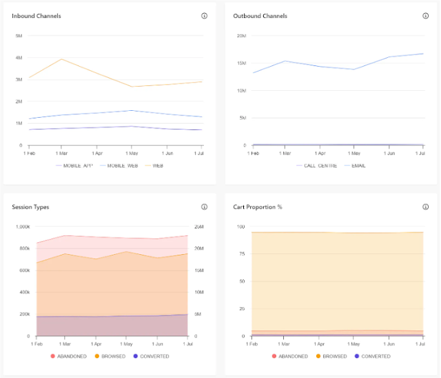
Inbound Channels - This graph represents the inbound sessions by channel type over the selected time period. Channel type can be mobile, web, etc. The number of inbound sessions is calculated by summarizing each channel type for the selected timeframe resolution i.e. all sessions for each day, week, or month.
1. To observe the inbound channels for a given time point, hover the mouse over its segment in the graph. An information callout displays which represents the inbound channels.
2. Click on the name of the channel in the legend to remove it from the graph.
Outbound Channels - This graph represents the outbound sessions triggered by channel type over the selected time period. Channel type can be email, call centre, etc. The number of outbound sessions is calculated by summarizing each channel type for the selected timeframe resolution i.e. all sessions for each day, week, or month.
1. To observe the outbound channels for a given time point, hover the mouse over its segment in the graph. An information callout displays which represents the outbound channels.
2. Click on the name of the channel in the legend to remove it from the graph.
Session Types - This graph represents the different session types over the selected time period. The number of sessions is calculated by summarizing the following types across all the channels for the selected timeframe resolution i.e. all sessions for each day, week, or month.
1. Abandoned Sessions - These are the sessions during which a cart activity occurred, but a transaction did not occur over the selected time period.
2. Browsed Sessions - These are the sessions during which no items were added to the cart and also no transactions occurred over the selected time period.
3. Converted Sessions - These are the sessions during which a transaction occurred over the selected time period.
Cart Proportion % - This graph represents the proportionate view of all the sessions by type i.e. converted, abandoned, or browsed over the selected time period. The distribution is calculated by summarizing each type and dividing it by the total number of sessions.
Along with all these graph views you also get options to update the Summary Report based on the filters. You can also download the report as a ZIP file containing the CSV files.
References
Dashboards in Sitecore CDP - https://doc.sitecore.com/cdp/en/users/sitecore-cdp/dashboards-in-sitecore-cdp.html
Summary Report in Sitecore CDP - https://doc.sitecore.com/cdp/en/users/sitecore-cdp/summary-report.html
That’s All for Today,
Happy Coding
Coders for Life